Levis Launderret
This may have to be BBH at one of there bests! this ad caused such an up roar in the 1950's and was one of the first ads to include music in an advert. I love how all the women get shocked about this, from this ad you can see how most of the Levis ads today have developed into sexually appealing ads.
Muller Ad Wunderful Stuff
This is such a happy advert and can be shown to people aged 10-40 as the characters involved are from every eras generation, it shows ordinary things getting taken over by the muller effect.
Tuesday, 8 November 2011
Tuesday, 1 November 2011
Analysing Adverts!
Red Bull Gives You Wings
Most of the Red Bull Adverts are animated which is one of there consistent themes, i like how this particular one shows and odd oldish man just walking along and a pigeon poo's on him, so he reacts by drinking red bull flying up and doing the same thing back to the pigeon. I enjoy there scenarios every time a new Red bull Ads is on as they never seem to be the same apart form the consistent colour theme.
This is such a good advert. And cats do stare a lot, so what would happen if they did have thumbs? cats rely on there owners to feed them and give them attention but with thumbs they can do what they want. Its funny and the target audience is for everyone.
So this must have to be the most annoying advert in history!! the song is catchy and sticks in your head, the Go Compare man himself is the most annoying thing ever, i just cant stand this advert.
Tuesday, 25 October 2011
Analysing Adverts!
Adidas Advert 2011
To me this advert just says, Adidas is a way of life! Adidas is in everything. There is a lot of celeb endorsement throughout this advert, which shows its a massive brand. The music ties in nicely, and just seeing snippets of clips leaves you wanting to see more or maybe create your own adidas experience. The advert shows Adidas in more than just clothing but sponsors and equipment too.
This advert is literal but gets the message across that by using Lynx Excite not only will you get beautiful women even angels will fall for you. The music ties in with the angels very well, they cant get enough of the scent when they find the man. Its a very well constructed and thought through advert.
Monday, 17 October 2011
Analysing Adverts!
Twinings Advert
This advert works very well for the brand and it is definitely aimed at the older generation. I do like how it tells a story other than the animation it is such a simple advert, at the end there isnt even any one speaking over the top of the music the copy just shows up, simple short and sweet. You dont have a lot of these story adverts about which is why i also like it, the soothing music lets you think the tea is soothing and relaxing too.
The new birds eye ads have to be my favourite of all time!! I just find them sooo funny. I like how they use a polar bear as they live in the arctic and the freezer is a cold place. His voice is clear and the message is put across easily. He also describes the food and tells her why to use birds eye and nothing else! in most frames the only thing standing out is the birds eye product. I cant wait to see more of these.
Tuesday, 11 October 2011
Benetton Analysed!
This campaign was made in 1989 by Oliviero Toscani these posters then went on to shape the following 11years of Benetton. Both these posters are to get across that skin colour isnt an issue. They have nothing to do with the clothing brand but they are highlighting a global issue and these strong images defiantly got attention and there message across.
Monday, 3 October 2011
Analysing Adverts!
Dove Viral Avert
I chose to analyse the Dove viral ad as it makes a massive impact and point to all women out there. It speeds up the process it took this women to get to be on a magazine/ billboard. you see her have her hair and make up done then how she is changed on photoshop. Im glad Dove did this as finally someone is showing that all the women you see in everyday media are not real women.
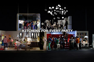
Iv loved this advert since the first time i saw it! It makes ikea seem fun, as i know a lot of people hate to go shopping in ikea. The tune is catchy and its song links in with the advert really well, there is a series of Ikea Kitchen with different parties going on and these 2 guys attend every one of them, the message is that there is a kitchen for every type of party. I love the use of colours lighting and tone in this, the bold bright colours also work really well with the dimmer lower tones.
Tuesday, 27 September 2011
Analysing Literal Ads
Cilit Bang Advert!
This Cillit Bang Ad does exactly what it says, it gets the message across and even shows the product working. It used bright bold colours which are in your face so u cant miss the advert when its on the TV. Im not a big fan of this advert its too in your face!!
I much prefer this literal ad to the Cillit Bang advert, it doesnt get the message across in an annoying way. Its clear and to the point, the man wants to paint his door, ronseal says it will will be dry and waterproof in 30min so he paints the door and in 30 min its dry. So its making the point "It does exactly what it says on the tin" completely true.
Subscribe to:
Comments (Atom)


